We started Rise as a simple way to provide people living in Nigeria with dollar-denominated investments across the US, Nigeria and other markets to earn returns that grow their money. Our mission at Rise is to help connect our users to world-class investment portfolios that help them create meaningful wealth and achieve their financial goals.
In the past year, our company has grown and connected to thousands of users. In that time, we have gained more clarity on our identity, values and the needs and expectations of the many users of Rise. Based on that, we decided to simplify our brand identity while reiterating who we are and our promise to our customers.
“Everyone can build and rise with us.”
After several sessions with the brilliant folks at Dá Design Studio, we understood that this was the most important message we wanted to share with our users. We want everyone to know that world-class investment management is not only for the privileged rich. That with Rise, anyone can enjoy simple, high-quality investment management that raises their standard of living.
We want users to witness their quality of life, net worth and financial well-being grow as Rise takes care of their money in the background while they focus on living their lives. We will be the financial company that is on their side, protecting their interest, helping them grow and leveraging our expertise, technology and access to global markets to create wealth for them.
In addition, we wanted to create a sense of community because Rise was born from our investment community and wealth creation is always a collective journey. Our users understand that to use Rise is to build something not just for now, but for the future, and to truly elevate one’s financial standing regardless of who and where you are.
In with the new
A new wordmark and letter mark: Simple, yet straight to the point. If a full stop, which normally sits at the bottom, can rise, then all of us can.
A new typeface
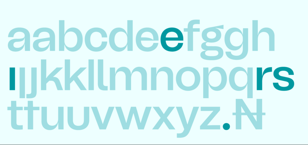
Tomato Grotesk is a contemporary Grotesk font. It appears confident and established. It has the appeal of the traditional corporate grotesk, but also has ultra-contemporary details which makes it quite distinct.
Colours
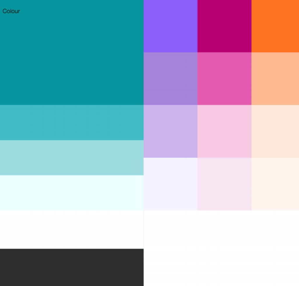
Retaining the teal is an opportunity for a smooth transition from the old identity to the proposed new one. So many things are changing. Keeping something with significant brand equity, like the brand colour, is super important. It allows for the new, but keeps things familiar.
Illustrative style
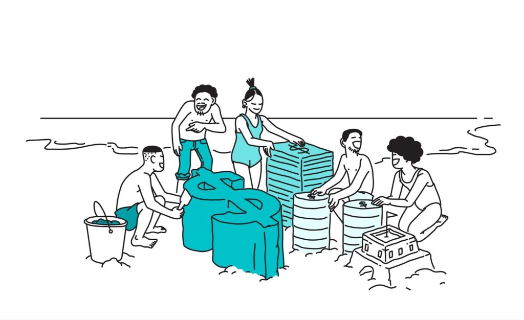
Our new illustrative style expresses inclusion and helps us communicate important things in a warm way. The goal is to create illustrations that are representative of our community, yet also flexible and scalable for our diverse communication needs. The quirky line work and metaphors bring a lighthearted feel to our brand without compromising the seriousness of what we do.
Patterns
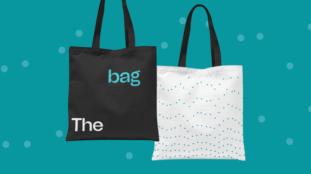
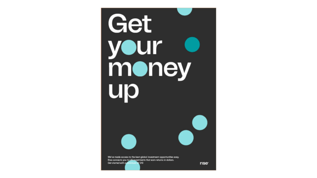
The rising dot is multiplied and expanded to create our patterns, with each dot representing the community of people who rise together and simultaneously.
3D Assets
Our Website
We are moving from rise.capital to risevest.com. We discovered that when people search for or talk about us, they refer to us as Risevest. Our goal with this new website is to give visitors an easy and clear way to learn about us and how we can support their journey to wealth.
There’s more, we’ve refreshed the app!
Beyond brand identity design, we’ve redesigned the app to greatly simplify your experience and delight you at every touchpoint. We are introducing a new way to fund, more goal-based plans and much more! We are rolling out the new app in stages over the next 5 days, so be on the lookout for when you can update your app and begin to enjoy this new experience.
As we move forward, our promise to you is to be your wealth-building partner in every sense of the word, connect you to the best global investment opportunities, and give you stress-free wealth management.